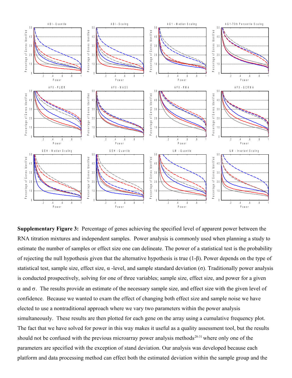
Supplementary Figure3: Percentage of genes achieving the specified level of apparent power between the RNA titration mixtures and independent samples. Power analysis is commonly used when planning a study to estimate the number of samples or effect size one can delineate. The power of a statistical test is the probability of rejecting the null hypothesis given that the alternative hypothesis is true (1-β). Power depends on the type of statistical test, sample size, effect size, α -level, and sample standard deviation (σ). Traditionally power analysis is conducted prospectively, solving for one of three variables; sample size, effect size, and power for a given and. The results provide an estimate of the necessary sample size, and effect size with the given level of confidence. Because we wanted to exam the effect of changing both effect size and sample noise we have elected to use a nontraditional approach where we vary two parameters within the power analysis simultaneously. These results are then plotted for each gene on the array using a cumulative frequency plot. The fact that we have solved for power in this way makes it useful as a quality assessment tool, but the results should not be confused with the previous microarray power analysis methods28-31 whereonly one of the parameters are specified with the exception of stand deviation. Our analysis was developed because each platform and data processing method can effect both the estimated deviation within the sample group and the measured distance between groups and traditional power analysis methods failed to show this dynamic. Unlike a spike-study where only a relative few genes are examined, but the truth is know, our study describes the measurement characteristics of 12,091 genes, but must rely on probabilistic inferences. Therefore, we have elected to use the term assisted or apparent power to distinguish our findings from those studies that use titrations of known quantities of a given gene. In this supplementary figure each microarray platform and normalization method is represented in a separate panel.Solid lines in each graph illustrate the apparent discrimination power between the A and C samples while the dashed lines illustrate the apparent discrimination power between the B and D samples. The blue, red, and gray lines represent site 1, site 2 and site 3 respectively. This analysis used the standard formula for the power of two-sample t-test using a pooled estimate of standard deviation(spooled). The mean difference between groups A and B and between groups C and D was computed for each transcript, and the s at each location was calculated independently and plotted by location. The x-axis displays the calculated apparent power and the y-axis displays the percentage of genes which have that apparent power or greater. Expression values from the common set of 12,091 genes were included in the analysis. Outlier arrays were removed as specified by the array manufacturers13. The differences between groups of sample replicates were computed for each gene; the Spooled for each location was calculated independently and then pooled using the standard method. The key component of this method is the generation of cumulative plots of the proportion of genes achieving a power, based on gene-by-gene calculations. This figure illustrates a larger number of genes have higher levels of power for the B vs. D sample comparison (dashed lines) relative to the A vs. C sample comparison (solid lines), which is likely due to mRNA abundance differences. This figure clearly illustrates the choice of normalization technique has a large impact on apparent power of discrimination between the samples. The apparent power calculations were based on data from the 12,091 common genes set and no filtering related to gene detection was performed. Three probes were removed from the analysis because data were missing in three or more of the groups. We implemented a novel power analysis based on Warnes & Liu’s method ( with four key modifications. The average difference between groups was explicitly calculated for each probe, a pooled estimate of σ (spooled) was used, and plotting of experimentally derived apparent power. The key component of this analysis is the generation of a cumulative plot of the proportion of genes achieving a desired power for a given sample size (n = 5), α (0.001), and a probe-by-probe spooled for each site and measure difference between groups at each site. Using this tool the results are expressed as the number of genes on the y-axis with a calculated power equal to or greater than a given power on the x-axis. For each comparison, the apparent power analyses for all test sites using the same microarray platform are grouped to display the extremes of test site performance. Cumulatively, each platform has similar apparent power across the 12,091 genes, but for each of the platforms, at least one site shows a significant loss of apparent power due to increased technical noise (see Supplementary Fig. 4). In addition, the apparent power analysis is asymmetric between the sample pairings (A, C) and (B, D) as indicated by the differences between the solid and dashed lines within each graph. This asymmetry is likely the result of the A sample being more similar to C than B is to D. The utility of the titration samples for assessing normalization and data preprocessing methods can be seen throughout the analyses presented here. Interestingly, for all platforms with the exception of AFX and ILM, the MAQC “standard” normalization or data preprocessing method performance was slightly inferior to the secondary method, especially in the apparent power analysis. This result highlights the observation noted throughout this study that data processing methods determined to be optimal under one set of circumstances may not always prove appropriate under all conditions, particularly if primary assumptions underlying those data processing methods are violated.
Supplementary Figure3: Percentage of Genes Achieving the Specified Level of Apparent Power
